
Veraia is a brand that reveals the power of the inner gift. Created for those who sense subtle energies, it invites deep connection with nature. Each oil carries the potent energy of Himalayan herbs, awakening hidden abilities within
Magic for the Chosen
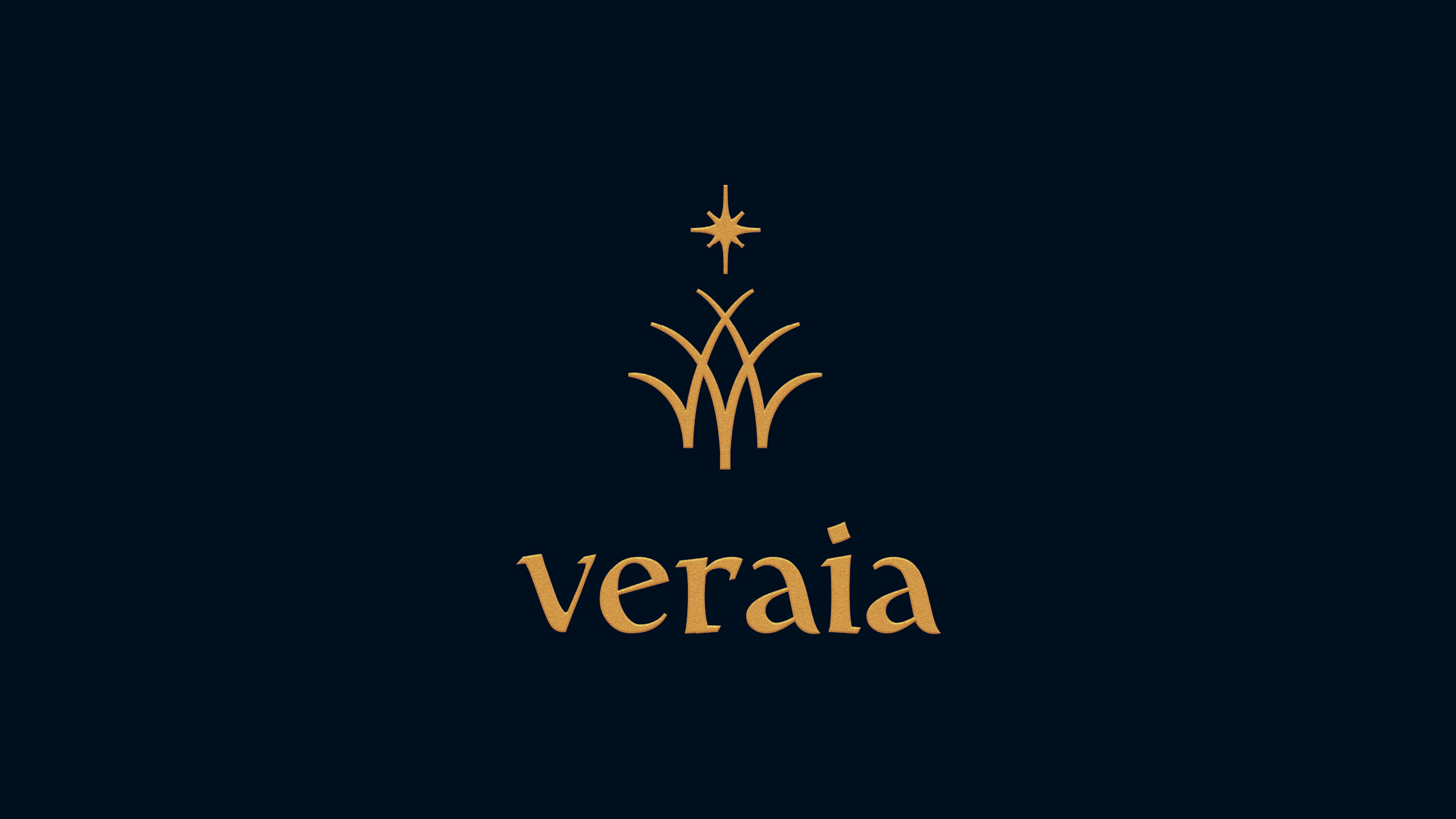
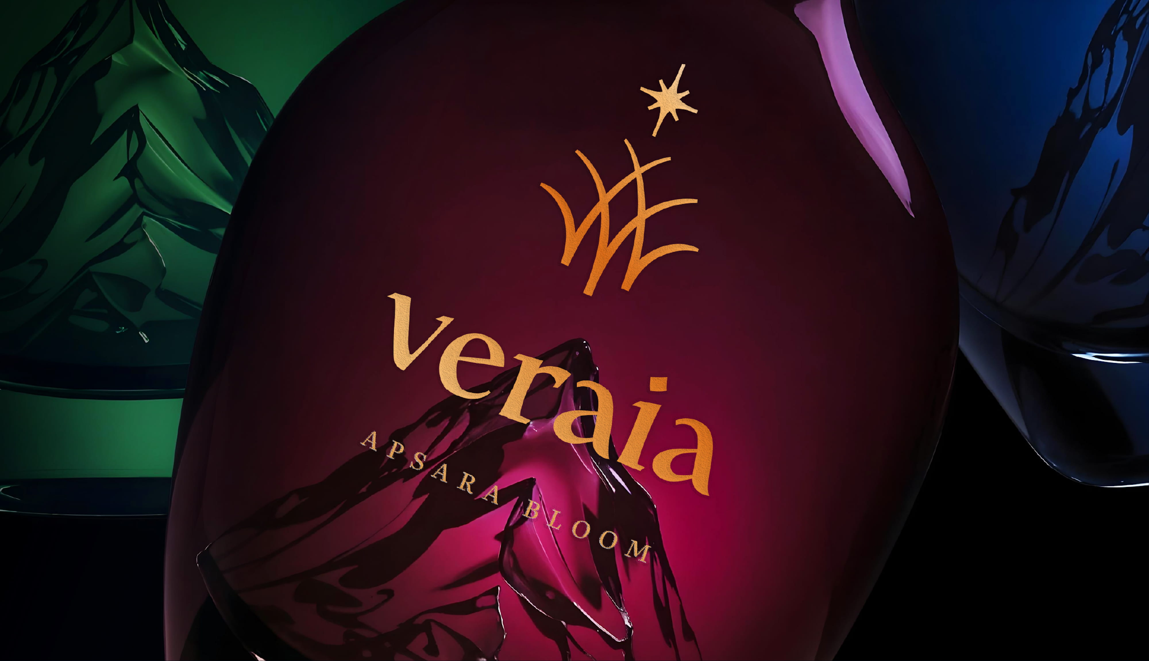
The Veraia mark is a woven pattern of herbs forming the letter V, crowned by a guiding star. It symbolizes a connection to nature, the personal journey, and the unfolding of magical potential. Elegant typography enhances the sense of refinement and mystique
Logo and Symbol

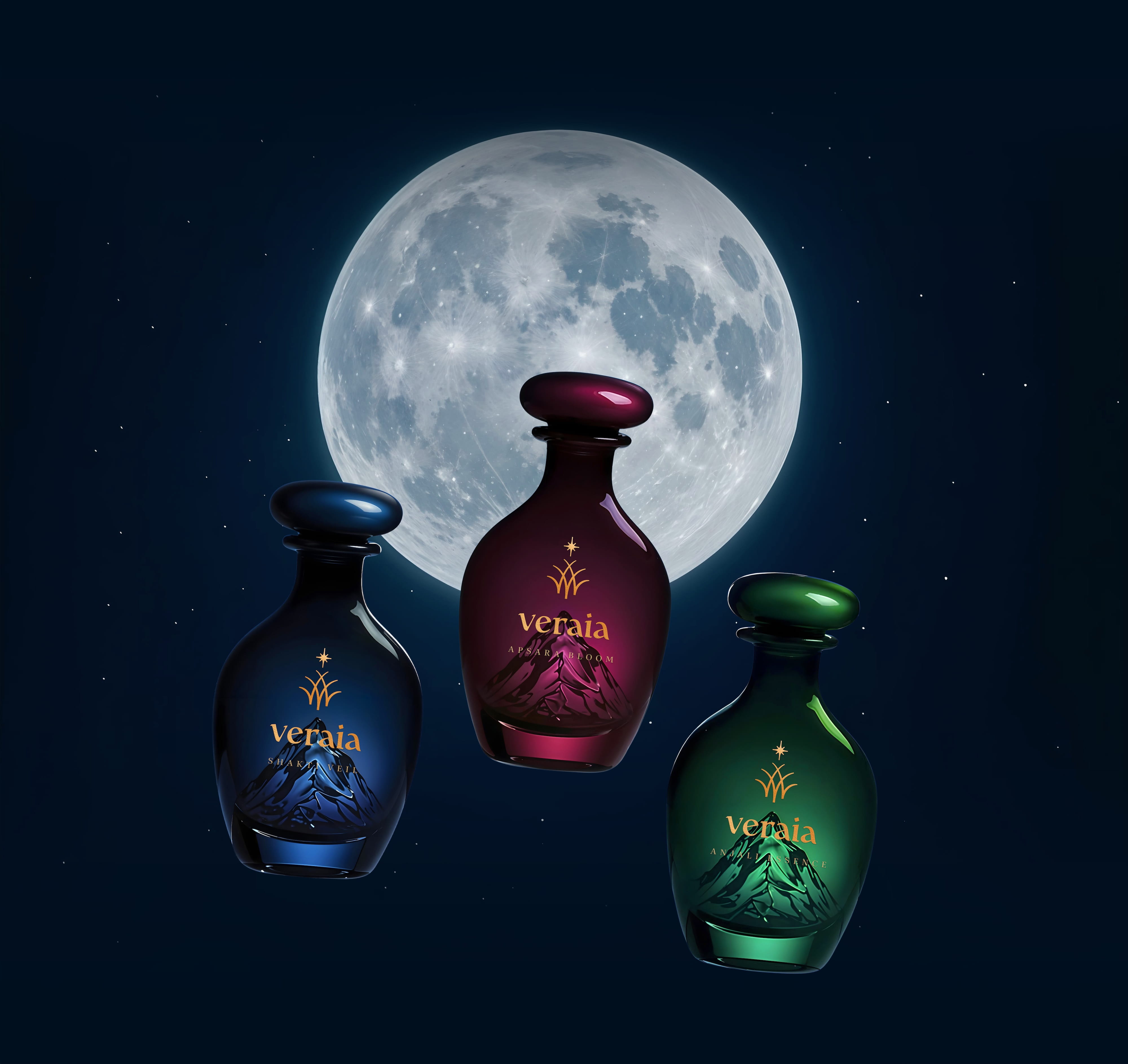
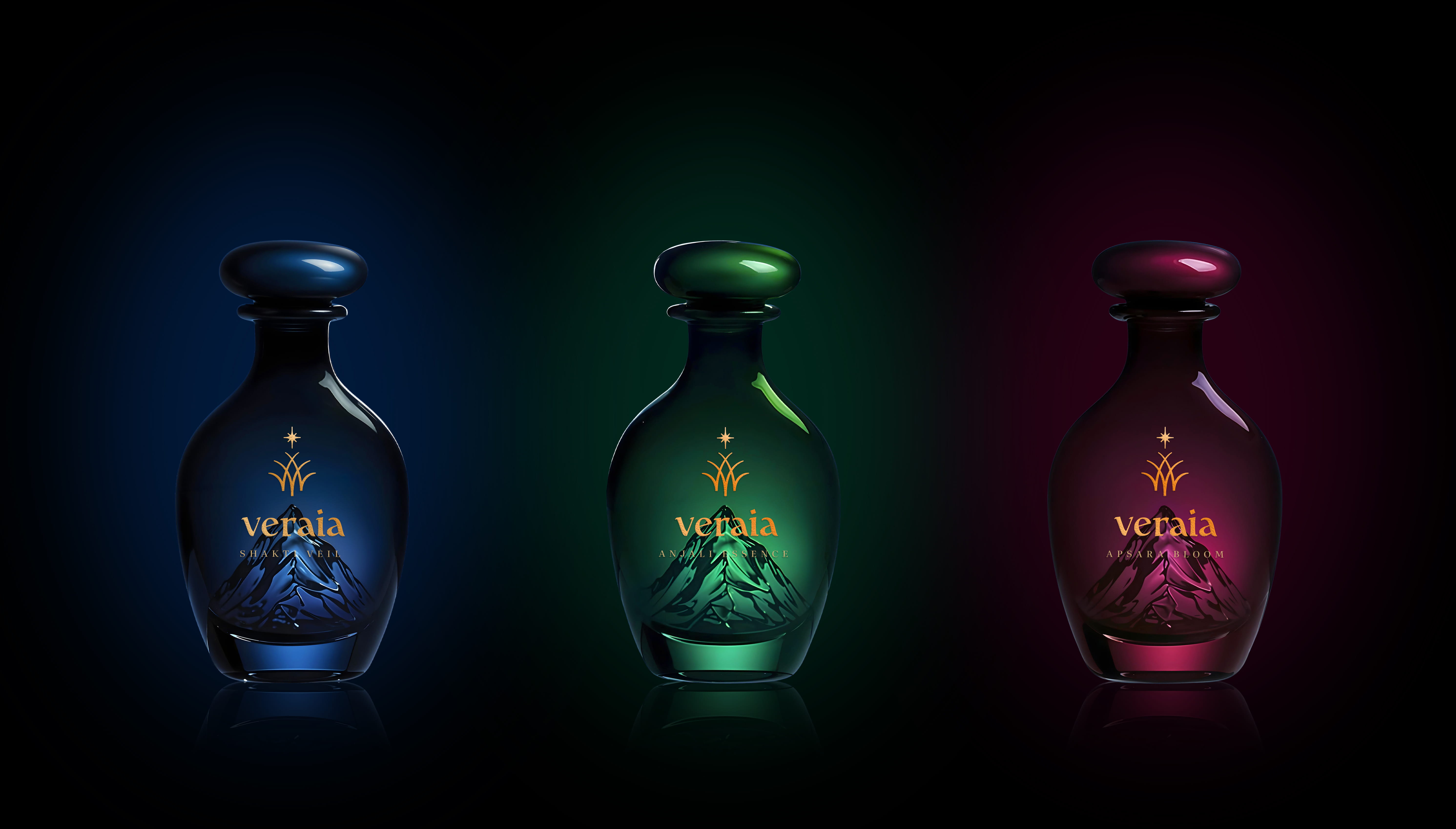
Inspired by ancient alchemy, the bottles hold a miniature glass mountain inside — a symbol of origin, purity, and strength. The color gradient represents a journey from the unknown to clarity. A golden logo adds the final touch of luxury and power. The matte, velvety surface feels like a mist of mystery — concealing and revealing at once. It sparks intrigue, hinting at something far beyond an ordinary product
Packaging
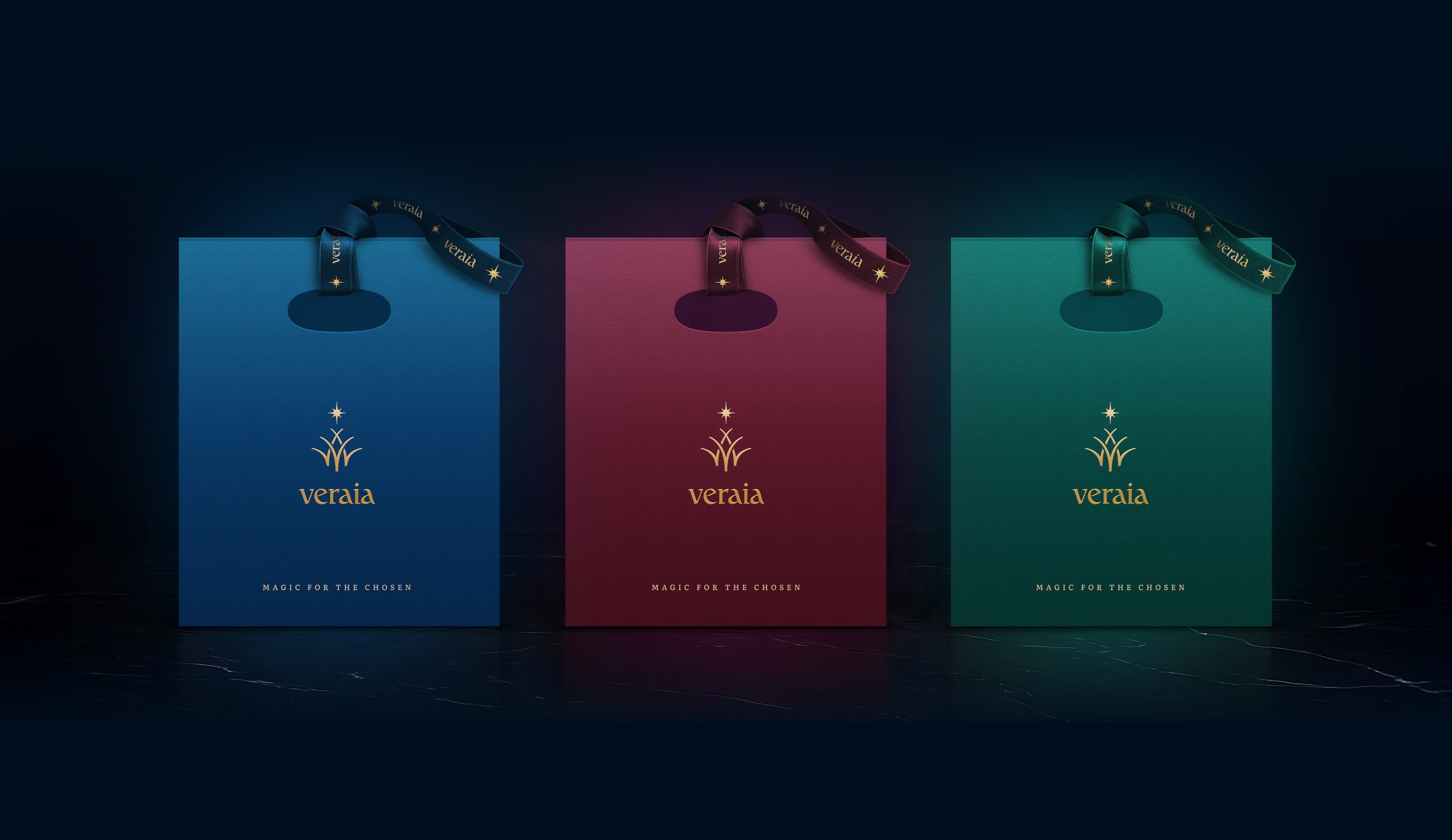
The set includes oils, incense pyramids, a velvet pouch, and an instruction card. A semi-transparent lid veils the contents with softness and secrecy. Layered packaging and rich textures enhance the sense of magic and exclusivity
The Gift Boxes

Each incense pyramid complements the oils, creating a sacred space for meditation and transformation. Custom holders, postcards, and posters expand the visual universe of Veraia — glowing with mystic patterns and cosmic textures.
Atmosphere of Ritual


Veraia is an invitation to a world of subtle energy — a world only visible to those who see beyond the surface. It’s a key to self-discovery, ritual, and transformation. This is not just a product. It is magic — for the chosen
Magic for the Chosen

Naming, Branding & Packaging
Created in collaboration by VONK × Alekhina Agency
Naming, Idea, Vision & Creative Direction
Viktor Ostrovsky, Natalia Alekhina
Design
Daria Stefu, Tanya Ponomarenko
___
Veraia was born from light, depth, and collaboration.
If you’re seeking design with soul — let’s create magic together!
Cookies managing
Cookie Settings
Cookies necessary for the correct operation of the site are always enabled.
Other cookies are configurable.
Other cookies are configurable.